 In this article I will discuss some thoughts on shot composition, and specifically considerations on the rule of thirds, focus, subject placement and framing.
Whilst there is no one way that you can make your pictures stand out, there are a few basic rules of thumb that you can think about when composing a shot that may improve your image.
As with most skills though, practice is the key! Enough introduction, lets get on with the article.
The rule of thirds
One great way to improve a shot is to consider the rule of thirds. Composing a shot so that is is broken up into thirds is more pleasing to the eye. So for example, if you are taking a shot of the sea against the sky, if you allocated one-third of the image to the sea, and two thirds of the image to the sky, your resulting shot would be more pleasing.
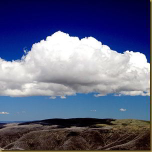
Take the shot below as an example. There are two clearly defined subjects, taking up roughly a third of the image each. Some cameras have an overlay mode that you can activate you help you divide up the screen. With practice though, this sort of image division will come naturally.
Focus
Deciding what is in and out of focus to your shot is very important for the image composition, and can be controlled with appropriate depth of field. See my previous article for more on that. If you are taking a portrait image, it is likely that you will want the subject matter to be sharply in focus, with distracting background detail blurred out.
A landscape shot on the other hand, will probably require most of the subject matter to be in focus, unless you are focusing on a specific object. Below are a couple of shots of the same subject matter with different focus. This radically changes how the image is perceived.
Subject placement
A common mistake when composing a shot is to place the subject matter right in the centre of the shot. This doesn’t generally make for eye catching imagery. Think about putting the subject off centre, and wondering how to draw the viewers eye to your subject.
If you are shooting a castle for example, maybe there is a road leading along to the castle. The viewers eye would naturally be drawn to the road, and follow it to the castle. Think about what in your shot is likely to draw the eye, and compose your shot appropriately to engage with the viewer.
In the below shot of a pinnacle in the pinnacles desert, the pinnacle itself is located off centre and sharply in focus, whilst the rest of the shot is sufficiently out of focus so as to not overly distract the viewer.
Framing
Framing is another technique you can use to ensure your viewer is looking at what you want them to be looking at, and not being distracted by background periphery. Essentially what you do is use surroundings and objects to “frame” the shot.
Tree branches are a good example - if you compose your image so that the tree branches are around the object in question then this will cause the viewer to focus on what is important.
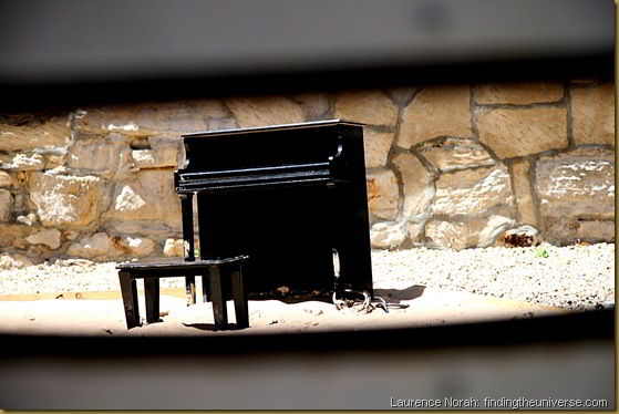
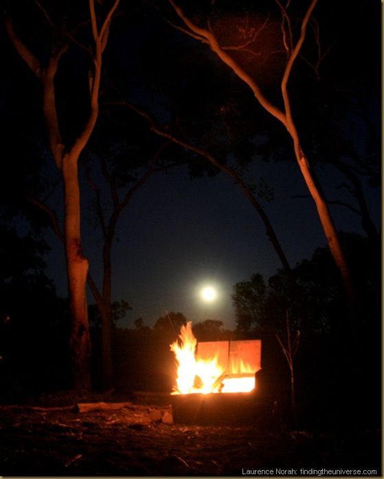
A couple of examples of framing are below, the first shows a miniature piano, framed by looking through a hole in a door, the second shows the moon rising over a campfire, framed in some trees.
Those were four basic techniques that you could think about using when taking photos. As with all rules, sometimes they are best ignored – often the best shots are those which break with convention and challenge the viewer.
Get out there and practice, and I hope these tips will help you improve your image library! If you have any thoughts on image composition, feel free to share them below, or join in on the site’s Facebook page.


0 comments:
Post a Comment